Personal project
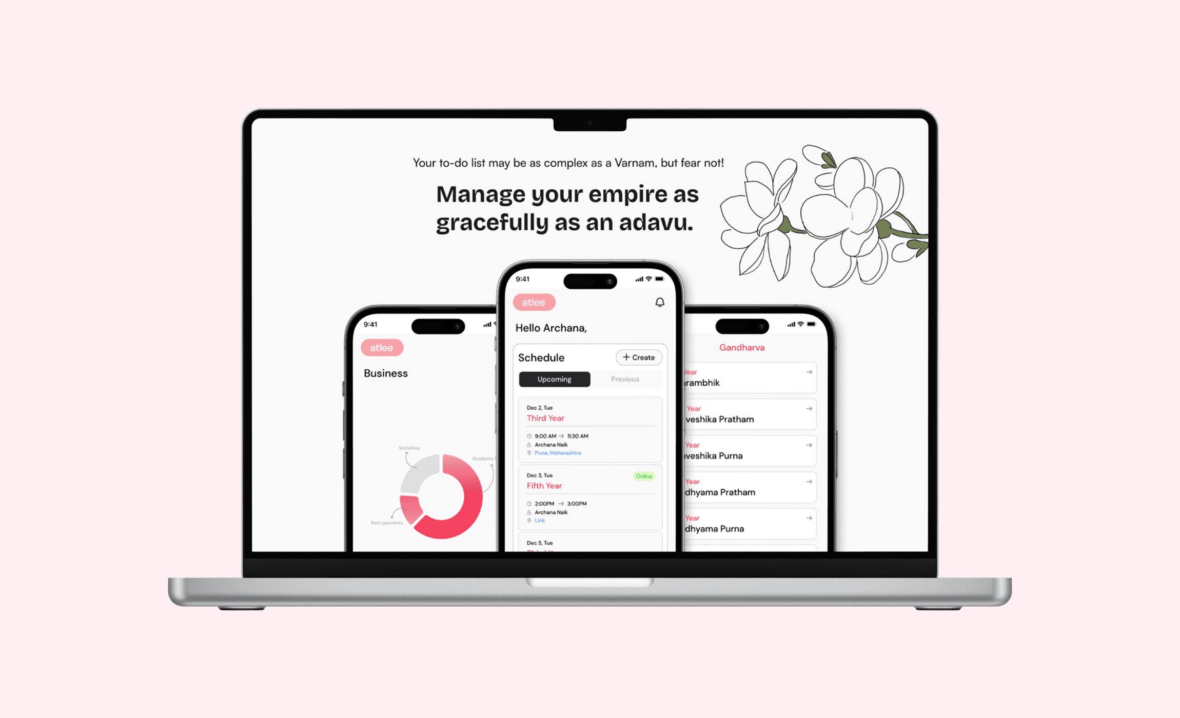
Atlee is an all-in-one management platform for performing arts institutions, consolidating event scheduling, fee management, resource organization, and communication into a single product. Now a B2B product serving a dance institute for 18+ months.
Visit Website
role
Product Designer & Co-founder
timeline
June 2024 - September 2025
Deliverable
Product strategy, market research, user flows, MVP design, design system, beta validation
Challenge
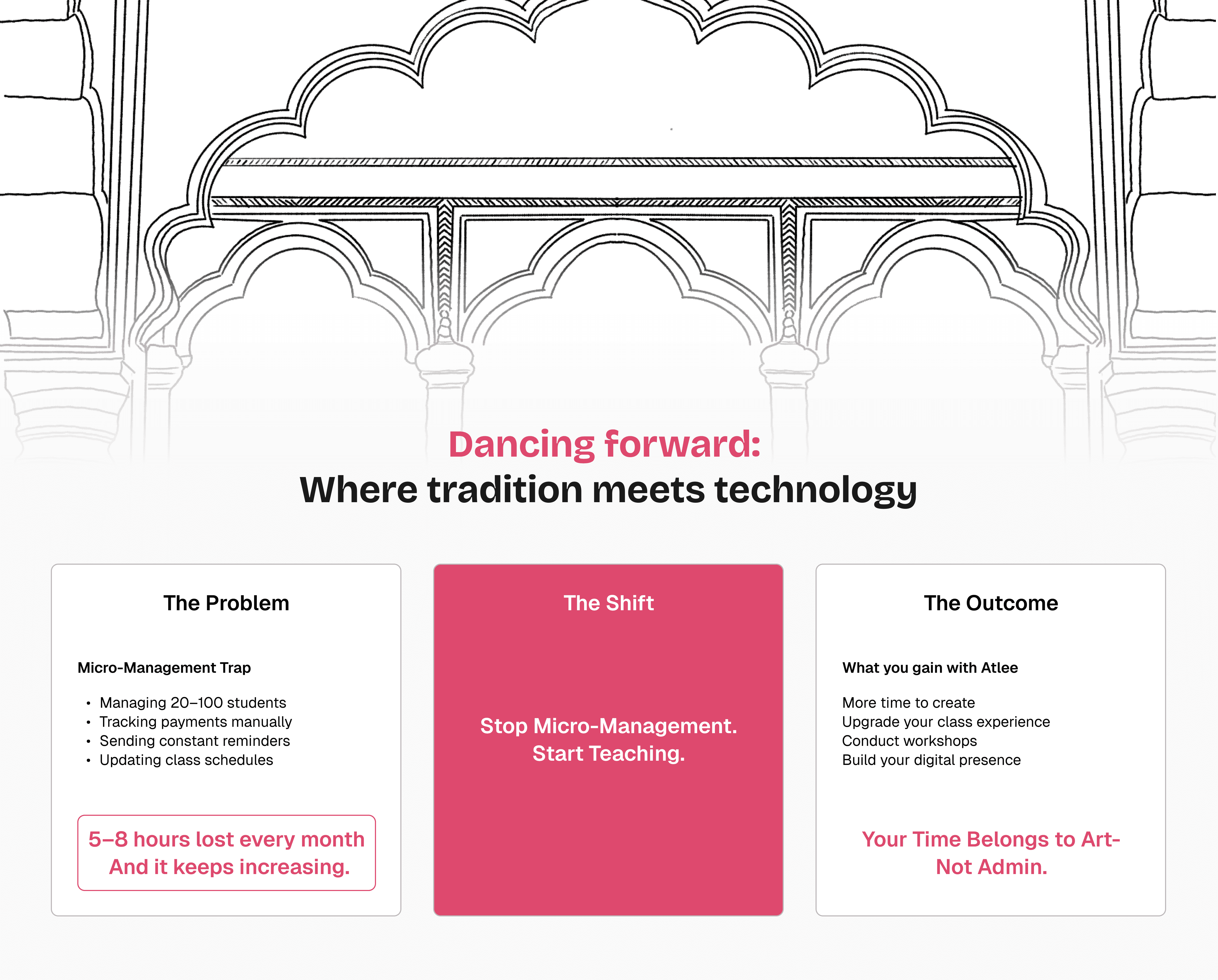
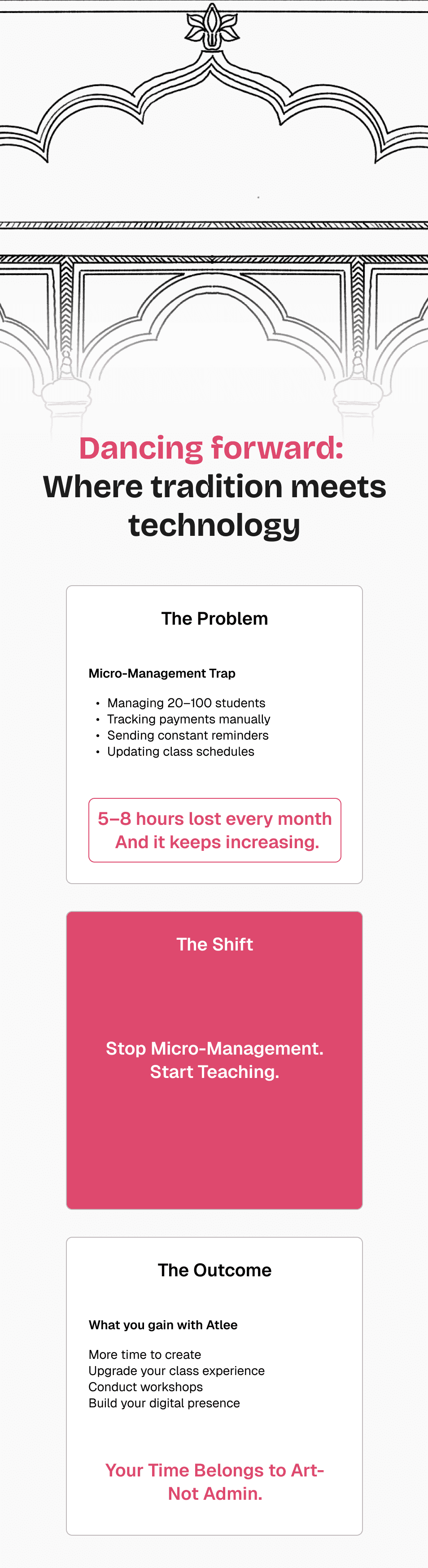
Why waste time doing micro-management?
Imagine you're a dance teacher with 200 students. Every day, students text you asking "when is the class?" You lose track of who paid and who didn't. You spend the minutes between teaching sessions answering the same questions.
Most performing arts institutes in India rely on a fragmented mix of WhatsApp for communication, UPI for payments, and paper records for everything else. This leads to missed deadlines, disorganised resources, and inconsistent fee tracking, especially painful for small institutes managing 50-300 students.
What I heard,
in numbers
50+ artists
Teachers interviewed across India
5+ disconnected tools
Per institute (WhatsApp, UPI, email, paper records, spreadsheets)
40% payment delay
Recorded via WhatsApp
(inconsistent). Can't pay
studio rent or assistants'
salary
Research & Discovery
I spoke to 50+ teachers across India before designing anything. Interviews focused on three questions: how do you currently run the day-to-day, where does time leak, and what have you tried that didn't work?
I mapped patterns in FigJam: pain points, workarounds, and the specific moments where teachers lost trust in a tool and went back to WhatsApp.
Three patterns held across every institute:
Fee collection was reactive, not systematic. Teachers chased payments individually
Students asked the same three questions daily (class time, resource location, dues) - teachers answered them one by one.
Resources lived in personal Google Drives or teachers' phones. No central place, no version control.
The Strategic Decision
One design constraint changes everything
Every feature in Atlee was built around a single UX decision: no feature access until the monthly fee is paid.
This was a deliberate constraint. Standard practice in Indian small-business apps is to keep everything accessible and send reminders. I tested reminders in early interviews — teachers said reminders got ignored. Payment behaviour didn't shift.
Instead, I designed the app so the schedule, resources, and communication features all sit behind a paid state. Students who want to check tomorrow's class time have to pay first. Once paid, all features unlock for the month.
The habit loop I designed for:
Student wants schedule → must pay first → unlocks all features → checks app 4-5x/week
Teacher stops chasing payments → the system enforces the deadline
Habit loop created with one UX decision
Why this worked:
Teachers weren't asking for a payments app. They were asking for a way to stop being the enforcer. Feature-gating moved the enforcement from a person to the interface — teachers stayed teachers, students paid on time, and daily engagement increased as a side effect.
Design System
Two apps: Teacher and Student- needed to feel like one product without duplicating work.
I built a shared component library in Figma, structured around four principles:
One system, two audiences. A Fee Card in the Teacher app shows aggregate student status; in the Student app it shows personal dues. Same component, different data source, same visual grammar.
Progressive disclosure. Every screen has a scan layer (glance-and-go) and a detail layer (tap to expand). Teachers standing in low-light dance halls needed to scan fast. Students on their own time could dig deeper.
FlutterFlow-compatible tokens. Because the MVP was built in FlutterFlow, tokens had to map to what FlutterFlow supports natively. Colour, spacing, and typography scales were chosen to keep design intent intact while staying inside build constraints. Custom components were kept minimal, every non-native addition added dev time.
Video-ready containers. Dance content is video. Resource tiles were designed to support MUX video embeds without breaking layout at any breakpoint.
Components in the system:
Fee Card (Teacher variant, Student variant)
Schedule Tile (upcoming / previous / online states)
Access Lock (the soft-block screen from the payment flow)
Status Pills (Pending / Paid / Overdue)
Resource Tile (text / image / video variants)
Navigation shell (bottom nav for Student, side nav for Teacher)
payment design versions
I started with the payment flow because it was the load-bearing decision. Every other feature depended on getting this right.
V1 - Wireframe stage
I mapped three variations of the fee-gate flow. The main tension: how visible should the paywall be?
Aggressive gating (block on app open) risked driving students to uninstall.
Passive gating (banner only) would defeat the purpose.
The chosen version: students land in the app normally, but tapping into schedule, resources, triggers a soft-block screen, "Kindly pay pending fees". Go to profile section > Pay fees > Monthly/Yearly.
Aggressive enough to change behaviour. Passive enough that students didn't feel punished.
V2 - Post testing
V1 assumed students would understand the gate immediately. Testing with 150+ students and parents showed they didn't - 3 of the first 10 parents thought the app was broken.
V2 added:
A one-line status message on the home screen
A clearer "Pay now" CTA
Timely payments went from 60% to 80%. Weekly student logins settled at 4-5 sessions per week per student.
Building With the Team
I owned product strategy, research, design, and testing. Handoff was structured around three collaborators:
I built a shared component library in Figma, structured around four principles:
One system, two audiences. A Fee Card in the Teacher app shows aggregate student status; in the Student app it shows personal dues. Same component, different data source, same visual grammar.
Progressive disclosure. Every screen has a scan layer (glance-and-go) and a detail layer (tap to expand). Teachers standing in low-light dance halls needed to scan fast. Students on their own time could dig deeper.
FlutterFlow-compatible tokens. Because the MVP was built in FlutterFlow, tokens had to map to what FlutterFlow supports natively. Colour, spacing, and typography scales were chosen to keep design intent intact while staying inside build constraints. Custom components were kept minimal, every non-native addition added dev time.
Video-ready containers. Dance content is video. Resource tiles were designed to support MUX video embeds without breaking layout at any breakpoint.
Impact & Outcomes
Operational Efficiency
Students now aware of regular classes without last-minute check-ins; resources accessible anytime
Payment Consistency
Fee payment habit loop created through feature-gating, reducing teacher follow-up time
Platform Adoption
1 institute using platform for 1 consecutive year; 2 institutes in active testing
Scalable System
Built reusable design and business framework adaptable to music schools and other performing arts
Key Learnings
Talking to users before building saves time and builds the right product
Small design constraints can drive meaningful behavioral change
Bridging design and sales gives a clearer understanding of real market needs
Future Scope
My MSc thesis at Hochschule Rhein-Waal validated the next evolution of Atlee through a high-fidelity prototype tested with 10 participants. The system achieved a 4.3/5 usability score, with 90% reporting improved learning efficiency and 80% finding chunked choreography effective for skill retention.
Four validated features ready for integration:
Real-time feedback centre with time-stamped annotations replacing fragmented WhatsApp corrections
Chunked learning modules breaking choreography into 4–8 count segments to reduce cognitive load
AI pose estimation using MediaPipe to automate posture feedback and reduce teacher workload
Progress tracking system with visual Learning → Practising → Polished stages and practice streak badges